
Current Affairs
News

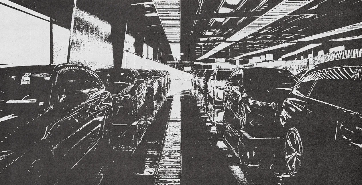
Benecar is once again Marca Recomendada in 2026
Created by Tiago Fernandes at Wednesday, 4 February 2026
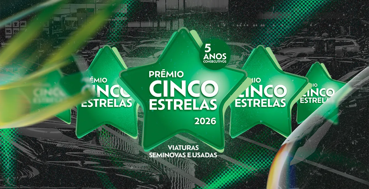
Benecar wins the Prémio Cinco Estrelas for the fifth consecutive year
Created by Tiago Fernandes at Wednesday, 4 February 2026
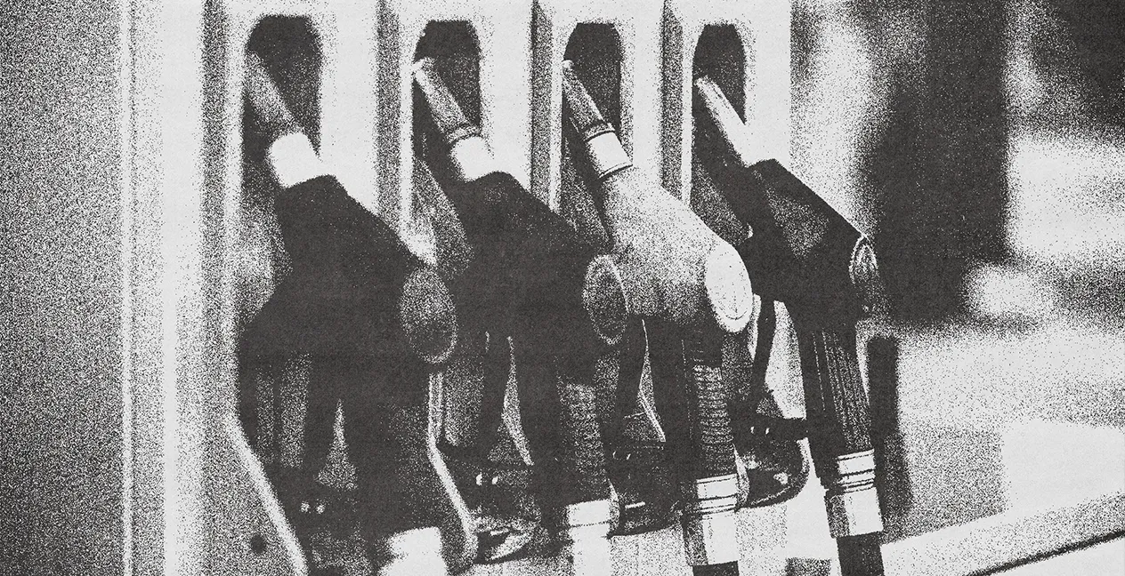
Fuel prices next week
Created by Lucas Luís at Friday, 17 April 2026

A stone hit your windshield? Here’s what to do
Created by Cynthia Batista at Tuesday, 5 May 2026

Alex Zanardi Dies: Motorsport Legend and Paralympic Champion
Created by Cynthia Batista at Monday, 4 May 2026
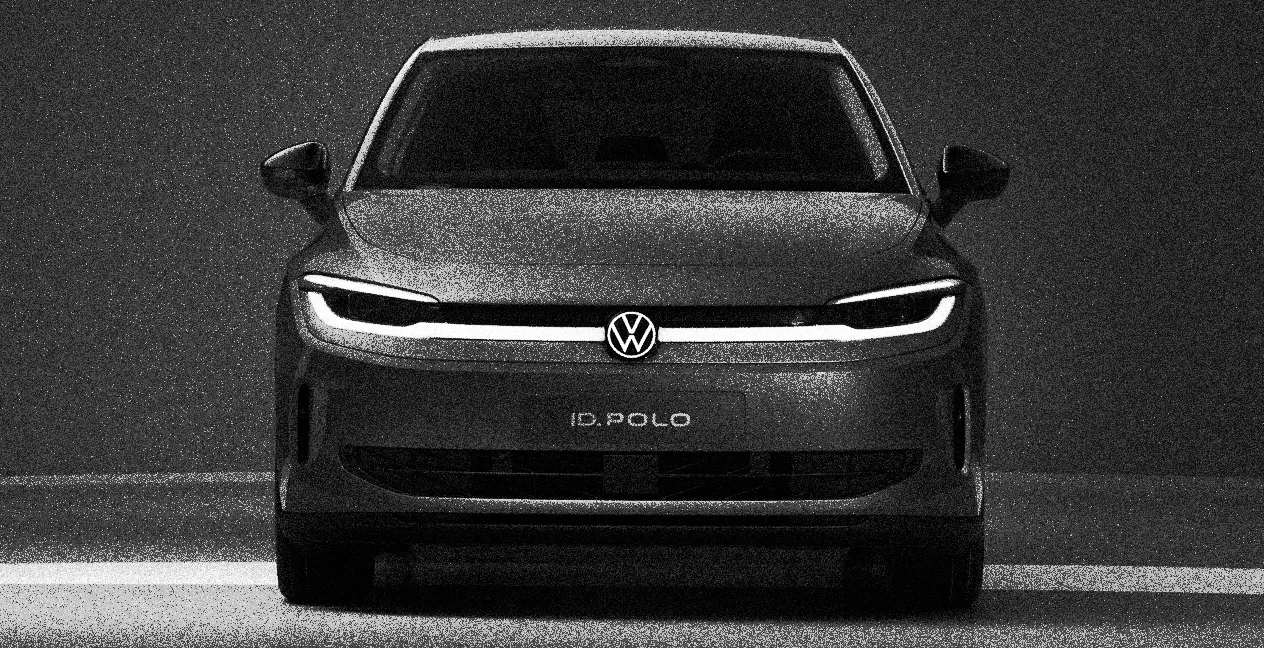
New Volkswagen ID. Polo: the compact electric car that wants to unite past and future
Created by Daniela Ezequiel at Wednesday, 29 April 2026

Clio and Twingo lead Renault’s strategy for 2026
Created by Daniela Ezequiel at Thursday, 30 April 2026
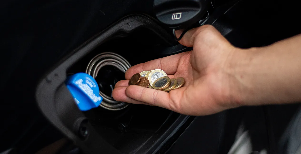
How to save fuel: 9 practical tips to spend less in everyday life
Created by Daniela Ezequiel at Thursday, 23 April 2026
New IUC dates approved: what changes for drivers in Portugal
Created by Lucas Luís at Thursday, 23 April 2026


